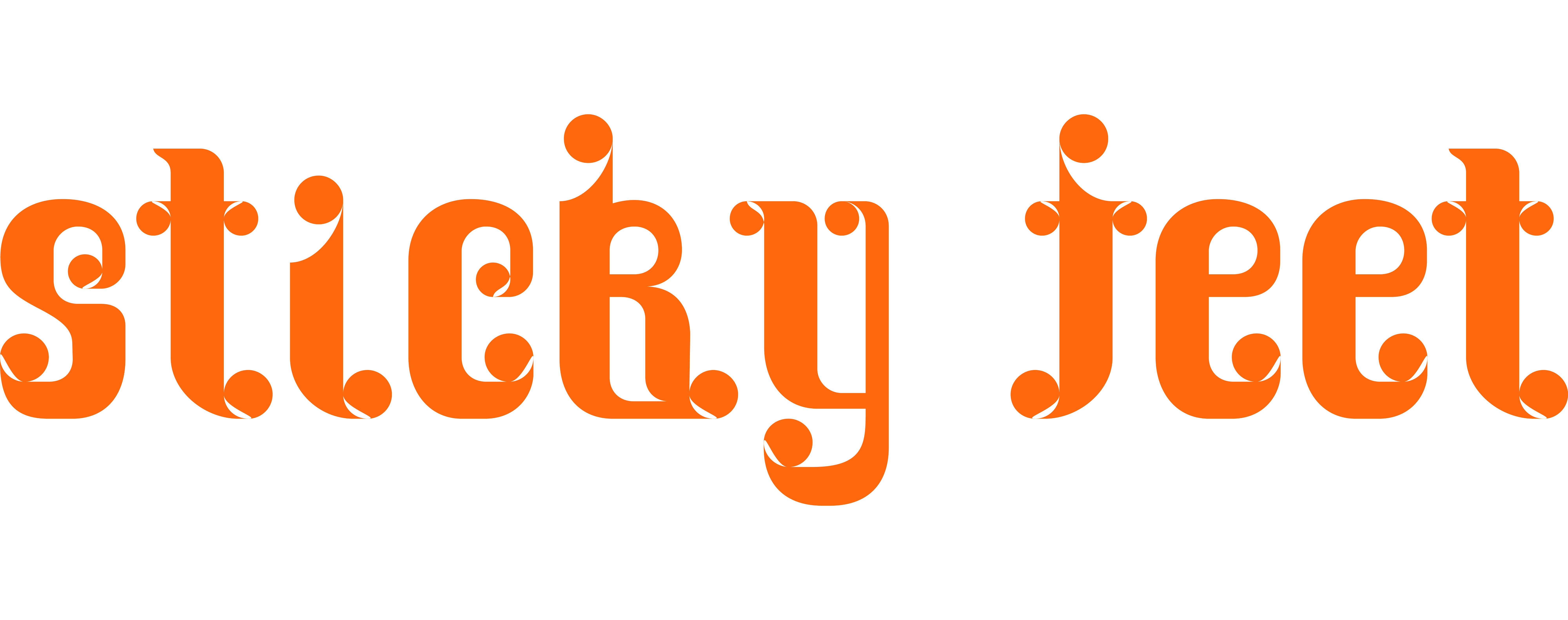
mihi nili is a display typeface designed during a 6-month type design class led by Radim Pesko. The original idea that initiated those quirky letters comes from the physical experience of travelling sensation: feeling warm, sweaty, like melting in crowded restricted spaces, sticky feet on the floor.
The intention was to replicate such sensations, by filling spaces that are usually empty, joining together extremities that aren’t meant to touch. I played with round shapes appearing in each letter, like drops of sweat on the characters. I wanted however for mihi nili to come accross as somehow joyful, fun and energetic to carry the excitement I personnally associate with the depicted journeys. The tyeface only exists in lower case.
The intention was to replicate such sensations, by filling spaces that are usually empty, joining together extremities that aren’t meant to touch. I played with round shapes appearing in each letter, like drops of sweat on the characters. I wanted however for mihi nili to come accross as somehow joyful, fun and energetic to carry the excitement I personnally associate with the depicted journeys. The tyeface only exists in lower case.


